
Round 2.1 Functionality. I said originally 0 to 3 marks but that is too many levels of distinction and I’m knocking that down to 0 to 2.
Does the cover get the job done?
- Who wrote it?
- What is it called?
- What kind of book is it? (tricky)
- What else do I need to know?
Aesthetics aside, this category is about the cover as packaging. Looking for readability and information.
Pictures below the fold – and at a smaller size so you get the thumbnail ebook feel.
Ancillary Mercy – Ann Leckie : Artist/Designer – John Harris(Artist)
 Reviews, awards, and New York Times bestseller make the cover quite busy. Title and cover art do all the work needed to let people know this is part of a series. Genre obvious. 2 points
Arcadia – Iain Pears : Artist/Designer – Nameless Hero(Artist)
 A very elegant cover but for that elegance to work it needs to be uncluttered. I like this version better than the other version BUT what would actually convince me to buy the book was who the author is. I didn’t recognise the name but I had read ‘An Instance of a Fingerpost’ some time ago. No telling what the book might be about other than a sense of mystery. The striking design works very well as a thumbnail. 1 point
Arcadia – Iain Pears : Artist/Designer – Thomas Cole(Artist)
 Title, author name and who the author is all fairly clear. Works OK as a thumbnail. Again, probably not a book that can clearly express genre on the cover. 1 point.
Barsk: The Elephants’ Graveyard – Lawrence M. Schoen : Artist/Designer – Victo Ngai(Artist)
 Main title and artwork well as a thumbnail. Other text gets lost but that is less of an issue when presented online. 1 point.
Children of Time – Adrian Tchaikovsky : Artist/Designer – Nameless Hero(tbc)
 Functional but unremarkable. A straightforward task done straight forwardly. 1 point.
Ctrl Alt Revolt! – Nick Cole : Artist/Designer – Nameless Hero(tbc)
 Works really well as a thumbnail because of big strong text well integrated with the overall design. Can’t see the other book he wrote at this size – but its there. Clearly about robots and stuff. 2 points.
Envy of Angels – Matt Wallace : Artist/Designer – Peter Lutgen(Artist)
 Name and title neatly done and works well at a thumbnail size. Not obvious what the book is going to be like but the playful image suggests a degree of humour. Chuck Wendig quote may draw in some fans. 1 point.
Europe at Midnight – Dave Hutchinson : Artist/Designer – Clint Langley(Artist)
 Functional. The artwork becomes even more obscure at this size. Additional information (even the review blurb – somebody at the Guardina liked it) tells me nothing. 1 point.
Half a War – Joe Abercrombie : Artist/Designer – Mike Bryan(Artist)
 Quite striking at a thumbnail size. Author and title clear. Title and design ties it neatly to the earlier books. Obviously fantasy of some kind without resorting to cliches. 2 points.
Hell’s Foundations Quiver – David Weber : Artist/Designer – Stephen Youll(Artist)
 DAVID WEBER – OK, OK author name looks like the book is shouting at me. Artwork gets a bit lost at this size but keeping it in a letterbox makes the author and title name superclear. “A new novel in the bestselling SAFEHOLD series” tells us what series it is part of – which is handy – but feels like it is trying to do too much in one sentence. The review blurb is about another book – if I follow David Weber’s books I’d get the connection but if I followed Weber’s book I’d probably have my own opinion. It looks like its there just to say “Gripping” on the cover. Some odd choices but not so odd as to give it zero. 1 point. Everything is getting 1 point at least it seems.
League of Dragons – Naomi Novak : Artist/Designer – Nameless Hero(tbc)
 Artwork is devolving into a mess of spiny tails at this size but still works. Name, title and neatly numbered position in the series. 2 points.
Raising Caine – Charles E. Gannon : Artist/Designer – Bob Eggleton(Artist)
 I’m surprised how well the artwork works at this size. Easy to mock Baen covers but they are typically practical. Name, title, series, related book all easy to spot. A review blurb by somebody I don’t know. Publisher logo plays a bigger role with Baen. I’m going to give it 2 points for being a crazy mess that works.
Seveneves: A Novel – Neal Stephenson : Artist/Designer – Jonathan Knowles(Artist)
 ‘A novel’ oh ok. Important information for those avoiding novellas. Functional but meh 1 point.
Somewhither: A Tale of the Unwithering Realm – John C. Wright : Artist/Designer – Jeremiah Humphries(Artist)
 Title? Tick. Series? Tick. Author? Tick. Genre? Looks like some kind of fantasy or maybe horror which is good enough for this category. Tick. Who is John C Wright? OK, I know who he is but maybe some reference to other work might help. However, if this book is a very different direction, that may be less important. Works well at thumbnail size. Dithering (somedither) between 1 and 2 points but I’ll be nice and give it 2 points.
Son of the Black Sword – Larry Correia : Artist/Designer – Larry Elmore(Artist)
 Weird it doesn’t have a prominent Baen logo unlike the Chuck Gannon book. Maybe because it is an attempt to branch out beyond established Baen readers. Big emphasis on Author and title. Cover and title hint strongly at heroic fantasy but avoids the obvious cliches. 2 points.
Sorcerer to the Crown – Zen Cho : Artist/Designer – Nameless Hero(tbc)
 Author gets a bit lost here. It might have been wise to have typography a bit more distinct from the art. Pretty but a bit unfucntional. “English magic faces its darkest hour” is the only clear clue to content. I’m going to be mean and give it 0 points because something needs to get o points otherwise why have 0 points available. Note that the cover is great in many other ways.
Sorcerer to the Crown – Zen Cho : Artist/Designer – Nameless Hero(tbc)
 More clear space, makes it easier to add text details. At this size the extra artwork detail of the two sillehouted faces gets even more lost (I missed it even in the large size originally). The additional text works nicely with the design. 1 point.
Souldancer – Brian Niemeier : Artist/Designer – Marcelo Orsi Blanco(Artist)
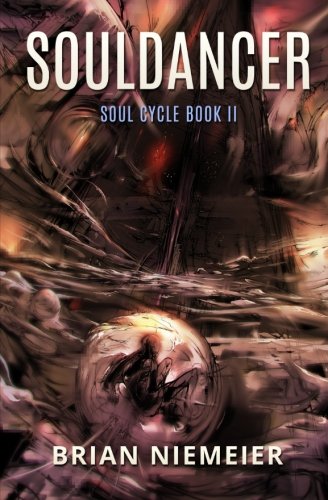 Functional. At this size the artwork looks a bit better than when larger. Title, series name, author all clear. Maybe some sort of tagline would help. 1 point.

2 responses to “Book Cover Award Thing 2016: Round 2.1 Functionality”
Interesting to see the connection between the marketing power of the author name, and the sheer size of the author name, e.g. Larry and Weber clearly get more prominence on their covers than Gannon. Debut author Cho gets teeny tiny font in one of her covers. It’s not a guaranteed tend though – Tchaikovsky is undersold for some reason despite having a dozen books to his name.
LikeLike
Short names help. Look at Lawrence M Schoen – teeny tiny.
For Tchaikovsky to be bigger on that cover he’d need to go ftom
Adrian Tchaikovsky
to
Adrian
Tchaikovsky
Mind you Zen Cho should be ideal for that.
LikeLike